





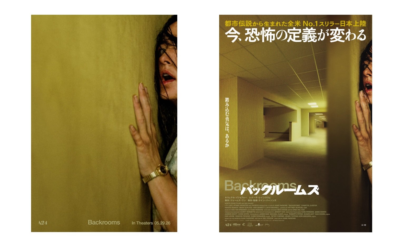
Japanese audiences will have to wait until September 4 to catch Kane Parsons’ Backrooms on the big screen, but A24 and local distributor Happinet Phantom Studios are already drumming up excitement for the film’s arrival. Unlike the minimalist posters seen in other regions—where actress Renate Reinsve is depicted crammed into a corner against a vast yellow wall—the Japanese version has sparked debate for its busy aesthetic, with some Twitter users in Japan labeling it “lame.”
This discrepancy highlights a broader trend in Japanese movie marketing, where posters often prioritize “telling” over “showing.” For instance, international hits like Parasite and La La Land have seen their original designs altered to include more text and imagery, sometimes even with content censorship, as seen with Parasite.
Japanese cultural critic, novelist, and philosopher Hiroki Azuma suggests this approach is deeply ingrained in the nation’s culture, manifesting in everything from the lengthy titles of isekai light novels to text-heavy tabloid TV shows. A former film industry designer notes that while designers aim for subtlety, distributors push for posters that advertise every aspect of the film, a sentiment echoed in the Backrooms’ Japanese trailer.
Given that Backrooms explores liminal spaces, where emptiness itself evokes unease and dread, it’s no surprise that some Japanese fans prefer the original poster’s minimalist design. Nevertheless, sleek Japanese movie posters do exist. The Exit 8 film, for example, took home the Best Poster Design award at last year’s Cannes Film Festival for its “minimalist, yet striking design.” Notably, that poster also features its protagonist against a yellow backdrop and draws inspiration from a video game centered on liminal spaces.